How much are your images worth?
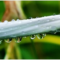
 Two months ago a design company expressed interest in buying the rights to use my images. They wanted to buy an initial 100 images as first batch. I was pleasantly surprised since the only other time I sold my images was years ago – a couple of pics to a travel website, and one to a local airline for their inflight magazine. Just small deals, but this one now is big. Photography is just a hobby, and if I get to earn on the side, well why not. They asked for the price of a picture. I gave them my rate. They were aghast. They said their current photographer sells them at a low, low price. I was shocked at learning of their photographer’s rate and commented that their guy was almost giving away his images for free! I searched for their photographer’s images and, bragging aside and with all due respect to that photographer, there was no point in comparing. The company owner admitted that my images were far superior in colors, details and composition, and were exactly what they were looking for. I said quality images don’t come cheap, just like any other quality product and service out there. They were upfront enough to admit that they had no budget for my rate. Did I budge? I’m always a reasonable guy, so I lowered my rate a bit considering that they were a start-up and were buying in volume. They said they’ll think it over and would contact me. A couple of months passed and I haven’t heard from them. Did I regret my decision? No. I still believe that quality images come at a premium. Every picture I take carries a part of me with it – my patience, my knowledge, my passion, my style. Heck, a bit of my soul is on every image I make. I can’t sell that for “two-cents” worth! You want cheap, then you’ll have to settle for a cheap image somewhere else. The flower pic above was one of the many they were interested in. What do you think?
Gosh I miss this community! I miss my blogger friends here! I hope everyone is doing fine. As I always encourage everybody – keep on clicking!

Without color

Article Excerpt:
Without color the components of visual design become that much more important. Look at the lines in the image. Are they horizontal? Vertical? Diagonal? Do they form a pattern? Rhythm or repeating elements in a photo are interesting, with a break in the repetition being even more interesting. Also look at the texture, shapes, and forms in the image. Concentrating on these will take your mind off the color and enhance your ability to “see” and think in monochrome.
~Joel Wolfson from his article Digital Black and White Photography Tips and Techniques

Photo Quotes 170

It is nature filtered through the mind and fingers of the artist that produces art, and the quality of the pictures depends on the fineness of that filter.~Henry Peach Robinson
Note: This is my 600th post since I started this blog 10 months ago. The fuel that got me going is my passion for photography. But the spark that always ignites that fuel is you, my audience. Through your visits, follows and likes I am inspired and encourage to further my craft and to share whatever learnings I discover. Thank you and enjoy your weekend!
Elements for B&W

Article Excerpt:
Here’s a run-down of the most common elements that you should look for when identifying a suitable subject for the black-and-white treatment. Remember that these elements can be used individually, or even combined to produce marvellous mono images with clout.
1. Contrast, shape & form
One of the fundamental aspects of black and white photography is that your whole composition relies on contrast (for on composing images, see our 10 rules of photo composition – and why they work). For this reason, look out for subjects that feature simple, strong lines and shapes. It’s often the shadows that define shape and form, so pay attention to areas of darkness, as well as light.
2. Tone
Black and white photos actually include a whole range of greys, which add subtlety to your images. Normally, you look for subjects that will translate into a range of tones from black to white, but you can also get great results where the subject is mostly light (high-key) or dark (low-key).
3. Texture and detail
Fine detail, or strong textures such as weather-beaten stone, foliage or clouds, can help to give your black-and-white shots depth and interest. Strong side lighting is perfect for bringing out the texture in any subject. You can use strong natural light, or get creative with flash to create sidelighting on the subject.
4. Graphic composition
Black-and-white images need strong compositions to really work. Keep an eye out for strong lines or features in your scene that can be used as leading lines, or positioned diagonally across the frame to create dynamic images.
~Black and White Photography: What Every Photographer Should Know

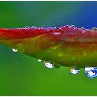
Try it with flowers
The one subject that will give you the best abstract images are flowers. Zoom in, macro or close up, and capture those delicate curves, arches, shapes and spirited colors, and bring them out in looming proportions and surreal dimensions. Crop out the edges, play with light, use selective focus or blur, present them in panoramic 16:9 aspect ratio or in tight 1:1 square format; you’ve got a lot of creative options in your toolbox. The approaches are yours to discover and experiment to come up with the best abstractions from nature’s little angels. Here are samples from my collection.


Enhance that abstraction

Article Excerpt:
The Power of the Selective Focus Technique
If you’re searching for an easy but effective abstract photography technique, selective focus is the technique for you. A narrow depth of field is achieved by the selection of a large aperture. The camera is then focused on the center of interest of the image. The rest of the objects in the image will fade into a soft blur.
There are two things which can be done to make your images even more notable when utilizing this technique. First, the color of the background should be different from the center of interest. The second point is that the center of interest can be made even stronger by using curves to point toward the center of interest.
The Use of Light and Shadows
Using the interplay of light and shadows can create drama in an image. Now, some photographers tend to think only in terms of light. This is a mistake — for light is nothing without shadows. Shadows are not just a lack of light. Instead, shadows function to make the light come to life. It is the shadows that shape the light, that draw attention to the light, and that integrate with the light to produce striking photographic opportunities. This is especially true with abstract images.
So, what is the shadows’ role in this technique? The primary role of the shadows is to help to define the forms. In other words, the shadows’ role is to help the forms to stand out. Consequently, it should come as no big surprise that the more interesting the objects in an abstract image, the more likely that the image will be successful. The shadows then function to make the more prominent.
~Ron Bigelow from his article Abstract Photography Tips and Techniques


Photo Quotes 158

Look at the things around you, the immediate world around you. If you are alive, it will mean something to you, and if you care enough about photography, and if you know how to use it, you will want to photograph that meaningness. If you let other people’s vision get between the world and your own, you will achieve that extremely common and worthless thing, a pictorial photograph.~Paul Strand
Photo Quotes 157

There is no abstract art. You must always start with something. Afterward you can remove all traces of reality.~Pablo Picasso
Be passionate about your photography

Interview Excerpt:
What are some tips you could give to people that really like your work?
Learn the basic photography techniques, learn how to edit and then learn to create your own unique vision. Everyone has his own vision, his own thoughts and feelings on the world we live in – try to discover what that is. That is more important than the technical skills. But most importantly: love what you do, be passionate about it and learn to create what YOU love, even if it means that no one else but you will appreciate what you’ve created.
~Joel Tjintjelaar on The Art of Black and White Photography from PhotographyOffice.com
Photo Quotes 155

A photographer must be prepared to catch and hold on to those elements which give distinction to the subject or lend it atmosphere. They are often momentary, chance-sent things…Sometimes they are a matter of luck…Sometimes they are a matter of patience…Leaving out of question the deliberately posed or arranged photograph, it is usually some incidental detail that heightens the effect of a picture…But the photographer must be able to recognize instantly such effects.~Bill Brandt
The most irritating color is also the most noticeable

Article Excerpt:
Which color is the most irritating?
Yellow, pure bright lemon yellow is the most fatiguing color. Why? The answer comes from the physics of light and optics. More light is reflected by bright colors, resulting in excessive stimulation of the eyes. Therefore, yellow is an eye irritant. Some claim that babies cry more in yellow rooms, husbands and wives fight more in yellow kitchens, and opera singers throw more tantrums in yellow dressing rooms. However, these reports have not been scientifically proven.
In practical application, bright yellow – when used in large areas, will irritate the eyes. Therefore, do not paint the walls of an office (or any critical task environment) yellow. Note: Lighter shades of yellow can be comforting and cheerful.
Also, beware of bright yellow legal pads (but this may give you a jolt and temporarily wake your brain up) and do not use yellow as a background on your computer monitor.
On the other hand, since yellow is the most visible color of all the colors, it is the first color that the human eye notices. Use it to get attention, such as a yellow sign with black text, or as an accent. Have you noticed yellow fire engines in some cities?
Finally, yellow is a wonderful color, the most cheerful of the spectrum. And yellow is a symbol of the deity in many global religions.
~article from ColorMatters.com
Graphic concepts in B&W

Article Excerpt:
Black and white helps to learn the basics without getting too distracted; this is one reason why it is so popular among teachers. Black and white focuses the attention on form, shading, pattern, and other graphic concepts, to give them an unusual quality with tone and hue.
With a clear view toward graphics, composition, and design, the photographer can concentrate on:
- How contrast creates lines and how lines lead the eye or psychologically affect the viewer by curving, lying flat, diagonal, or vertical.
- How shapes or lines make a pattern and how shape with texture gives an object form.
- How highlights compete for attention and dark tones create an important negative space.
Many artists prefer black and white because it causes the photographer and the viewer to see the world in a way that cannot be seen with the naked eye.
Seeing the reoccurring pattern, line, or shape is easier with black and white, which does such a good job of emphasizing it. This is especially the case when a black and white photo shows good contrast – when the blacks are black, the highlights are bright, when you can still see some detail in both the highlights and the shadows.
~The Merits of B&W…Thoughts and Tips on Taking Black and White Pictures from BetterPhoto.com
Which aspect ratio to use?

Article Excerpt:
…the aim of this article is to focus on understanding the compositional impact of different aspect ratios, and more importantly, how to pick the right aspect ratio for a given subject.
There are two ways to go about this – either you shoot only one aspect ratio (for instance 3:2 because you have a digital SLR) and arrange the contents of your frame around it, or you keep an open mind and match the aspect ratio to respect the subject and the dynamic of your composition. For instance, you might use a 1:1 square for a round object if you want a balanced frame, or you might use 16:9 and just focus on one curve if you want to highlight a particular detail in a cinematic manner – you never see movie shots showing the whole of Earth, for instance; it’s always a hemisphere with the sun rising in just the right place. This is not a coincidence!
~Ming Thein from his article Aspect Ratios and Compositional Theory
Photo Quotes 153

16:9 is a whole different ballgame from the old 4:3 format. You have more screen to use and in different directions. Use it wisely.~Kyle Cassidy
Creative control in still life

Article Excerpt:
There aren’t many photographic practices that date back further than still life photography. When photography originated, it was necessary for exposures to be quite long, so photographing static objects was the ideal subject matter. However, as the technology developed, the fascination for capturing still life has remained and is still one of the most viable photographic professions today.
At the top end, it is an extremely lucrative business, as magazines, catalogues and websites all require product shots. There are many advantages to working with still life that are often underestimated, so hopefully you’ll be able to see it’s scope for creativity and get started with taking some shots yourself!
Contrary to common perceptions, you don’t need a studio or a fancy location to make a start with still life photography. You can begin by simply using a space at home, such as a table placed by a window, along with a simple backdrop and utilizing a couple of lamps.
It varies greatly to landscape or portrait photography, in which you are provided with the subject matter, for example, a stunning mountain scene or a model, which come with a huge amount of variables, but the creative content is there in front of you. With still life photography, there are far less variables, you, as the photographer have complete control over the situation, including the subject matter, but you need to think extremely creatively in order to capture it in an interesting and engaging way.
~Simon Bray from his article 10 Tips to Get Started with Still Life Photography
Photo Quotes 152

We compose almost at the same time we press the shutter, and in placing the camera closer or farther from the subject, we shape the details – taming or being tamed by them.~Henri Cartier-Bresson
Discovery and development

Photography for me has always been these two activities – discovery and development. I have been photographing for almost a decade but half of it can be considered the juvenile stage. It was my snapshooting years. With my first point and shoot cam, it was literally that – shooting where I point. There was no thought in taking pictures. I was a tyro, a neophyte in the world of photography. True, I dabbled in painting and drawing in my youth and hence had an artistic sense in seeing and composing. This would not be put in use until 5 or six years ago when I developed the creative side in my photography – observing, thinking, composing, getting a better grasp of the technical. I unshackled myself from being a slave of “Auto” and basked in the new-found freedom of “Manual.” I did not go Pro because photography is not my main source of income, though there have been business entities and organizations who have directly bought some of my images. Its been some fruitful and productive years for this hobby of mine, and I saw myself, gauging from the images I have produced, grow and improve little by little, step by step, always discovering, learning and absorbing everything that has to do with digital imaging. Oh, just keep on clicking my friends!
Photo Quotes 150

We walk by wonders every day and don’t see them. We only stop at what shouts the loudest.~Barbara Bordnick
Fresh feel

Ad Excerpt:
Shooting aspect ratio 1:1 photographs, the square format will expand your creative enjoyment with the fresh feel of the framing and the strong subject presence produced by limiting the image field. This format is also convenient for blog use.
~Product feature of the GR Digital III from Ricoh.com
Note: the photo above was taken not with a Ricoh GR digital camera but with my Canon DSLR. The photo was used to illustrate the “fresh feel” of using the 1:1 aspect ratio, which is a camera feature of the GR.
Think away the color

Article Excerpt:
Black and white photography is a bit of an odd way to describe this type of photography. A black and white photo often contains mainly grey tones. This is why black and white photos are often called monochrome photos too.
Black and white photos give you their information by using luminance variations, not by showing variations in color. Your thoughts are not distracted by the colors and therefore the attention goes to subject, composition and lighting.
Not every subject is suited for a black and white photo and it isn’t always easy to ‘see in black and white’. There are, however, things you can pay attention to when looking for good subjects for your black and white photos. Subjects with lots of contrast will be more suited by the large variations in luminance. The right light is important; light that’s coming from an angle will make textures stand out. Light coming for only one direction will produce big differences in light and shadow…
Experienced black and white photographers are often able to think away the color in a scene. They imagine the scene in black and white. To do this, you’ll need a lot of practice, but it’s possible for anyone to learn. If you have a hard time trying to see in black and white you can always just take a black and white shot and view it the camera display. If you’re not using RAW, retake the shoot in color to be able to perform you’re own conversion instead of relying on the standard black and white conversion.
~Elja Trum from his article Black and White Photography; The World Without Color
The canonical perspective
Say again? Yes folks, I also had the same quizzical expression when I first found out about this “canonical perspective.” This is from a certain Jenika, a magna cum laude graduate of psychology from Yale, who runs her own portrait photography business and a blog called Psychology for Photographers. In her blog article titled Have a Photo Problem? Try Canonical Perspective, she explains that this perspective is “to the side and slightly above” view.

She points out the following:
- We tend to recognize all sorts of objects better when they are presented to us in canonical perspective.
- It helps make pleasing images because it goes along with how we “like” to think about objects.
- Most of us probably photograph objects using the canonical perspective “rule,” whether we’re explicitly aware of it as a rule or not.
- Canonical perspective neatly lines up with how the human mind likes to picture things.
Head over to the article and read in full this enlightening topic. Discovering something like this adds up to our arsenal of techniques when taking pictures. As Jenika said we may have been using the canonical perspective without us knowing it. Reviewing my image archive I found that I had lots of pictures with subjects taken “to the side and above 30-45 degrees.” Now we know what to call this kind of view.